
Writing A Science Explainer — A Case Study
Learning to create high-quality evergreen explanatory content from “Charting a Coronavirus Infection” by Dr. Katherine Wu and Jonathan Corum

2020 has been terrible, but one of the few silver-linings has been a steady output of high-quality science journalism. Whether it is mask-wearing, vaccine development, public health policy, outbreaks in meatpacking plants, or therapeutics, science journalists have been reporting every angle of COVID-19. Covering such a sprawling and quickly evolving topic is incredibly challenging, but an impressive contingent of writers have risen to the tasks.
Of the science journalism we have seen during the pandemic, perhaps the most important has been the explainers. “Explanatory journalism” may sound like a truism, but this term refers to stories meant to explain a phenomenon within a broader context. Rather than writing about “the news” it provides background about what is happening in the news. Current events can only be analyzed when thinking about them within a bigger picture.
This type of journalism isn’t especially glamorous: no breaking news updates, scandalous scoops, or fiery opinions. On the other hand, explanatory journalism has some advantages. Explainers often have an educational component — there may be some scientific or historical lesson in the story. Explainers also tend to be evergreen, meaning they have a longer shelf life than stories focused on current events.
In theory, explanatory journalism may sound easy. Rather than beating the pavement chasing down sources, you can simply skim through the research on a subject. This is not the case. The best explanatory journalism distills down the complexity of a field into an easily digestible article. Not only does the author need to summarize a ton of content, but it needs to be written in a manner that is clear and narratively compelling. Skilled writers can make this look effortless.
One of the best explainers I have seen in the Covid era was written by Dr. Katherine Wu in the New York Times. In the days following Trump’s Covid diagnosis, there was a flurry of breathless coverage about every aspect of Trump’s medical care. Rightly so — it was an incredibly consequential story. While that was happening Wu, working with New York Times science graphics editor Jonathan Corum, put out a two-part explainer: “Charting a Coronavirus Infection” and “Charting a Covid-19 Immune Response”. Both parts are tremendous, but the “Charting a Coronavirus Infection” was particularly striking. It was simple, direct, informative, and it had amazing visuals.
This article is an examination of what makes a good scientific explainer article, specifically focusing on Wu’s “Charting a Coronavirus Infection” piece. You do not need to read her article to understand this one, but I highly recommend it.
Hook with real-world events
Trump’s COVID diagnosis was the biggest news story in the entire world at the beginning of October. Any content that was tied to that story was going to get more views. Any responsible content creator is going to take advantage of the prevailing winds. Wu takes the events surrounding Trump’s Covid diagnosis and weaves them through her story in a manner that is both relevant and tasteful.
It should also be remembered that explainers are useful because they are explaining what is happening. Imagine if someone wrote an explainer about modern submarine technology. This topic might be interesting, but it isn’t explaining anything relevant to the news at the moment. Now, let’s imagine that there is some accident where a U.S. military submarine crashes and sinks, and there is a scandal about what happened. Not only will the article be more relevant, but it will also be able to focus on the topics most pertinent to the news. This improves the readability of the story.
Simplicity
Everything should be made as simple as possible, but no simpler. - Einstein
Wu’s writing is very simple. The sentences are short and unambiguous; sections are short and focused; she largely avoids unnecessary technical vocabulary or stylistic flair. In cases where complicated words are required, Wu generally provides a brief explanation of the term or includes a link to a relevant resource. Overall, Wu seems to be aiming for a grade 9 or 10 reading level.
There are also almost no numbers. Day ranges, like “four to five days” or “within two weeks” are used a few times within the article, but that is virtually everything. Only one percentage figure is included, and it is at the very end. Math-phobic people are often turned off or confused by almost any discussion of statistics or rates. Wu chose an approach that removed barriers for her readers.
Not all explanatory journalism requires this level of simplicity. There are plenty of great articles that are more technical. In this case, Wu chose to write the article for as broad of an audience as possible, including people who have not been following Covid science closely. Essentially, there is a trade-off. By including more technical vocabulary or detailed figures it would be possible to add depth to this article, but this would alienate other readers. No approach is better or worse in the abstract, but it is essential to pick an intended audience and stick with it. “Charting a Coronavirus Infection” managed to be accessible to those not following the news as closely, and still be informative to news junkies.
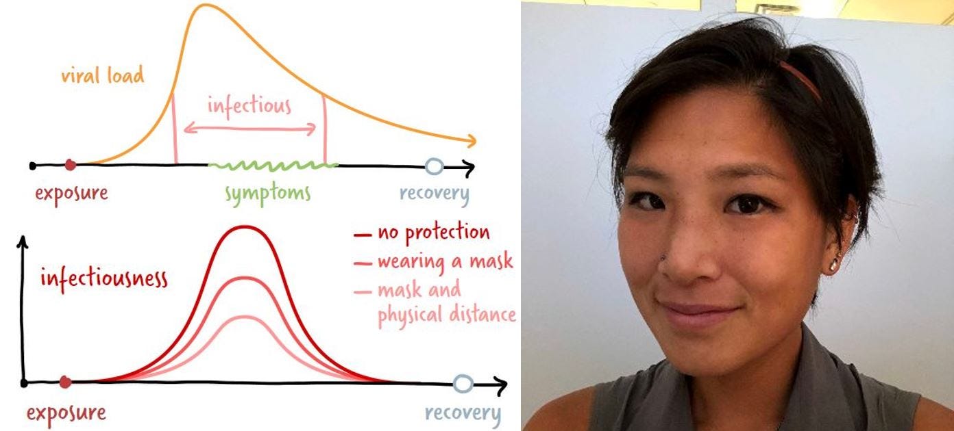
Visuals
While I have been heaping praise on Dr. Wu, this article actually has two authors. The second is Jonathan Corum, who I’m assuming was responsible for the visuals. In line with Wu’s text, these graphics are simple and clean.
One particularly attractive feature of these figures is the way they built on each other. By starting simple, then gradually adding complexity bit-by-bit, we eventually reach much more nuanced conclusions by the end of the piece. In essence, this feels like the role of explainers; if you start with the basics, and patiently build on them, it is possible to understand deep topics.
If you pay attention, you will notice that the “charts” actually break several graphing “rules”. The x-axis and y-axis are not labeled; there are no numbers; there are no ranges of error. While these are weaknesses for graphs in technical applications, here it is a strength. Remember, we are trying to keep the article accessible to people who are not strong in science or math. All those technical details greatly complicate the picture but don’t add much to the discussion. Corum has taken the form of the x-y graph and adapted it into something more suitable for his purposes.
Not only are these pseudo-graphs better for the intended audience, but they are probably more accurate than any “real” graph that could be prepared. The scientific findings are too uncertain to pin down usable graphs.
Levels of Certainty
One of the challenges in writing about Covid is constantly evolving science. Scientists are working very hard, but we should not overstate their conclusions in case they are later superseded by better research. Over-selling preliminary findings can cause confusion, as seen in the case of hydroxychloroquine.
Wu’s writing does a superb job communicating the level of uncertainty in each statement. Specifically, she seems to consciously assign each fact a level of certainty, ranging from “completely certain” to “completely unknown”. Here are some examples:
Complete certainty:
Infected people can also reduce the chance of passing on the virus by isolating themselves for at least 10 days after symptoms appear, as long as they continue to improve.
Scientists know that people who are male, older and obese — all descriptors of President Trump — are at higher risk for more serious effects of Covid.
High certainty:
Experts do not consider antibody tests to be a reliable way to determine whether a person is harboring the coronavirus.
If Mr. Trump’s symptoms appeared on Wednesday or Thursday, he may have exposed several people in the days prior. He most likely remains contagious now.
Lower certainty:
Some experts argue that true positives from rapid tests might coincide with the period in which people are most contagious, although this has not yet been confirmed.
Up to 40 percent of infections might lack symptoms, although some estimates have been even higher.
Totally unknown:
Separately, asymptomatic carriers of the coronavirus have also been repeatedly pinpointed as the source of transmission events, although how the virus behaves in the bodies of such people is less understood.
But many of the factors that catapult certain people toward severe forms of the disease remain a scientific mystery.
Wu is deliberate in evaluating each claim, making sure that it is clear how much to stress each fact. It is easy to get over-excited when writing about scientific findings, making statements like “research says” when you are relying on one sketch source. This is the real difference between a high-quality journalist and a random who is skimming the literature. Wu appears to have really done the reading and knows how much stress to put on each point.
When making a scientific claim, it is worth taking time to consider how certain it is. Who is making this claim? Is it one specific person/group, or are there several researchers who make similar statements? Are there sources that disagree? How strong is the evidence? How old is the source? Old sources might be outdated, but newer research may not yet be thoroughly vetted by the field.
Wu’s writing feels effortless. “Charting a Coronavirus Infection” braids together the details of current events with cutting edge science into a brilliant, concise explainer. This requires a mastery of the subject matter, a clear vision, and strong editing. Hopefully, analyzing this article has offered useful lessons in what high-quality science and explanatory journalism looks like.